Aimathic
Login | English | Deutsch

Free math worksheets

Build your own math worksheets from 30,000+ problems for grades 3 to 12, from fractions to AP Calculus. Every problem comes with step-by-step solutions.

Bivariate scatter plots and correlation

Click problems to add them to your worksheet.

5440549
Match each scatter plot with one correlation coefficient: \(-0.93\), \(0.05\), or \(0.71\). Explain each match.
Figure for problem 544054

Hints

- Use the direction of each point cloud to determine the sign first. - Compare how tightly the points follow a line. - Reserve the coefficient nearest zero for the plot with almost no linear direction.

Solution

1. Plot A forms a tight downward-sloping band, so it matches the strong negative coefficient \(-0.93\). 2. Plot B forms a moderately tight upward-sloping cloud, so it matches the positive coefficient \(0.71\). 3. Plot C has almost no overall upward or downward linear direction, so it matches \(0.05\).

Answer

A) \(-0.93\) B) \(0.71\) C) \(0.05\)
5440569
A spreadsheet reports a correlation coefficient of \(1.12\) for two quantitative variables. Explain why the output cannot be correct and state the full possible range of a correlation coefficient.

Hints

- Recall the numerical bounds built into the definition of correlation. - Compare the reported magnitude with the largest possible magnitude. - An impossible result signals an input or calculation error.

Solution

1. A correlation coefficient is always between \(-1\) and \(1\), inclusive. 2. The reported value \(1.12\) exceeds \(1\), so it cannot be a valid correlation coefficient. 3. The data range, cell selection, formula, or software entry should be checked.

Answer

The output is invalid. A correlation coefficient must satisfy \(-1\le r\le 1\).
5440689
Both scatter plots show positive associations. Which plot has the stronger linear association? Explain using the amount of scatter around an imagined line.
Figure for problem 544068

Hints

- First confirm that both plots have the same direction. - Imagine one straight line through the middle of each cloud. - Compare the typical vertical distance from the points to that line.

Solution

1. Both point clouds rise from left to right, so both associations are positive. 2. In plot a), the points lie close to an increasing line. 3. In plot b), the points are much more widely scattered around the upward direction. 4. Therefore, plot a) has the stronger linear association.

Answer

Plot a) has the stronger positive linear association because its points cluster more tightly around an increasing line.
5440839
A least-squares regression line slopes upward from left to right, and both variables vary. What must be true about the sign of the correlation coefficient? Explain without using a formula for the slope.

Hints

- Read the direction of the fitted line from left to right. - Connect an increasing linear pattern with the sign used for positive association. - The question asks only for the sign, not the coefficient’s magnitude.

Solution

1. An upward-sloping regression line represents a positive direction: larger \(x\)-values tend to be paired with larger \(y\)-values. 2. The sign of \(r\) records the direction of the linear association. 3. Therefore, the correlation coefficient must be positive.

Answer

The correlation coefficient must be positive because the fitted linear pattern increases from left to right.
5440459
A sailing club recorded wind speed and the speed of the same training boat under similar conditions. The scatter plot shows the six paired observations. Read the plotted coordinates from the grid, use technology to compute the correlation coefficient, and round to the nearest thousandth. Interpret its sign and magnitude in context.
Figure for problem 544045

Hints

- Read each plotted point as one paired wind-speed and boat-speed observation. - Keep the coordinates paired when entering them into technology. - Use the sign to describe direction and the distance from \(0\) to describe linear strength.

Solution

1. Use the six coordinate pairs shown in the scatter plot in a correlation calculation. 2. The correlation coefficient is \(r\approx 0.989\). 3. The positive sign indicates that greater wind speeds are associated with greater boat speeds. The magnitude is close to \(1\), so the linear association is very strong.

Answer

\(r\approx 0.989\). There is a very strong positive linear association between wind speed and boat speed in these trials.
5440479
A scatter plot of distance from a wireless router and signal strength has correlation coefficient \(r=-0.72\). A student redraws the plot with signal strength on the x-axis and distance on the y-axis. What is the correlation coefficient of the redrawn data? Explain why.

Hints

- Distinguish swapping the roles of the variables from changing their numerical values. - Correlation describes mutual linear association rather than predicting one designated variable. - Consider whether direction and strength of the point cloud change under reflection across \(y=x\).

Solution

1. Swapping the variables changes every ordered pair from \((x, y)\) to \((y, x)\), but it does not change how strongly the standardized values vary together. 2. Correlation treats the two quantitative variables symmetrically. 3. Therefore, the correlation coefficient remains \(-0.72\).

Answer

The correlation coefficient is still \(r=-0.72\).
5440529
A science class will make a scatter plot to study how air pressure changes at weather stations located at different altitudes. a) Which variable should be placed on the x-axis and which on the y-axis? b) Predict whether the association should be positive, negative, or have no clear direction. c) Describe what a strong version of that pattern would look like.

Hints

- Decide which variable naturally helps explain changes in the other. - Think about whether the response tends to rise or fall as the explanatory variable increases. - Strength describes how tightly points follow the overall direction.

Solution

1. Altitude is the explanatory variable, so it belongs on the x-axis. Air pressure is the response variable, so it belongs on the y-axis. 2. Higher-altitude stations generally have lower air pressure, so a negative association is expected. 3. A strong negative pattern would have points clustered closely around a line that slopes downward from left to right.

Answer

a) x-axis: altitude; y-axis: air pressure. b) Negative association. c) The points would lie close to a downward-sloping line.
5440539
Scatter plot a) consists of points exactly on \(y=100x+2\). Scatter plot b) consists of points exactly on \(y=0.1x-7\), with at least two distinct \(x\)-values in each plot. Compare the correlation coefficients. Does the steeper line represent a stronger linear association? Explain.
Figure for problem 544053

Hints

- Separate the idea of line steepness from the idea of scatter around a line. - Ask whether either set has any deviation from its line. - Correlation has no measurement units and does not equal slope.

Solution

1. Every point in Plot A lies exactly on an increasing line, so \(r=1\). 2. Every point in Plot B also lies exactly on an increasing line, so \(r=1\). 3. Correlation measures how closely points follow a line and the line’s direction, not the numerical size of its slope. Both associations are equally strong despite different steepness.

Answer

Both plots have \(r=1\). The steeper line is not a stronger association; both are perfect positive linear relationships.
5440559
A data set has correlation coefficient \(r=-0.03\). State a conclusion supported by the coefficient, and explain what additional features of the scatter plot should be checked before deciding whether the variables are unrelated.

Hints

- Include the word that identifies the kind of relationship measured by correlation. - A coefficient near zero summarizes only one type of pattern. - Look for structure that a straight line would not capture.

Solution

1. Since \(r\) is very close to \(0\), the supported conclusion is that there is little or no linear association. 2. The coefficient does not rule out a curved, clustered, or other nonlinear relationship. 3. The scatter plot should be inspected for systematic nonlinearity, separate groups, and influential points.

Answer

The variables have little or no linear association. The scatter plot must still be checked for nonlinear patterns, clusters, or influential points before concluding that the variables are unrelated.
5440599
Describe the scatter plot’s direction, form, and strength. State whether a linear model appears reasonable.
Figure for problem 544059

Hints

- Read direction from whether the cloud rises or falls from left to right. - Check whether the overall path is straight or curved. - Judge strength by how tightly the points cluster around that path.

Solution

1. The points generally move downward as \(x\) increases, so the association is negative. 2. The points follow an approximately straight pattern rather than a curve, so the form is linear. 3. The points lie fairly close to a downward-sloping line, so the association is strong. 4. A linear model appears reasonable because the pattern is strong, roughly linear, and has no isolated point that clearly dominates it.

Answer

The plot shows a strong negative linear association. A linear model appears reasonable.
5440619
The scatter plot shows four paired observations whose \(x\)-values are not equally spaced. Read the plotted coordinates, find the correlation coefficient, and explain whether unequal spacing prevents a perfect correlation.
Figure for problem 544061

Hints

- Read the four coordinates from the plotted grid. - Check whether one linear equation fits every point. - Correlation depends on alignment, not equal gaps between \(x\)-values.

Solution

1. The four plotted pairs all satisfy \(y=3x+7\). 2. All points lie exactly on an increasing line, so \(r=1\). 3. Equal spacing of \(x\)-values is not required. Perfect correlation depends on all points following one exact nonhorizontal linear relationship.

Answer

\(r=1\). Unequal \(x\)-spacing does not prevent perfect correlation because all four points lie exactly on the same increasing line.
5440639
The scatter plot shows six paired observations, including repeated \(x\)-values. Read the plotted coordinates and use technology to find \(r\) to the nearest thousandth. Explain why the repeated \(x\)-values do not make correlation undefined in this case.
Figure for problem 544063

Hints

- Read each plotted point as one paired observation. - Repeated values are different from a variable being constant. - Check whether each variable has any spread at all.

Solution

1. The correlation coefficient for the plotted observations is \(r\approx 0.956\). 2. The \(x\)-values repeat, but they are not all equal; \(x\) still has positive spread. 3. The points form a strong increasing band, so the coefficient is strongly positive and well-defined.

Answer

\(r\approx 0.956\). Correlation is defined because the \(x\)-variable takes more than one value and therefore has nonzero standard deviation.
5440679
For several delivery routes, the correlation between average driving speed and travel time is \(r=-0.82\). Interpret the sign and magnitude in context. Explain why the negative sign does not mean that higher speed is a “bad” outcome.

Hints

- Separate the mathematical meaning of a sign from an opinion about the context. - Ask what happens to one variable as the other increases. - Use the magnitude to describe strength.

Solution

1. The sign of a correlation describes direction, not whether an outcome is good or bad. 2. A negative coefficient means larger average speeds tend to be paired with shorter travel times. 3. Because \(|r|=0.82\), the linear association is strong.

Answer

The negative sign indicates direction only. Routes with higher average speeds tend to have shorter travel times, and the linear association is strong.
5440709
A calculator displays the correlation coefficient as \(r=0.000\) after rounding to the nearest thousandth. The unrounded value is \(r=-0.0004\). Is the correlation exactly zero? Describe the linear association accurately.

Hints

- Distinguish the displayed rounded value from the stored value. - Use magnitude to describe strength. - Avoid claiming exact equality from a rounded display.

Solution

1. The unrounded coefficient is negative, so it is not exactly zero. 2. Its magnitude, \(0.0004\), is extremely close to zero. 3. The data therefore show essentially no linear association, although the exact coefficient is slightly negative.

Answer

No. The exact value is \(r=-0.0004\), so it is slightly negative, but its magnitude indicates essentially no linear association.
5440739
The scatter plot shows three known points from a four-point data set. The missing point has coordinates \((3, k)\), and the complete data set has correlation \(r=1\). Find \(k\) and explain how you know.
Figure for problem 544073

Hints

- Translate perfect positive correlation into a geometric condition. - Use two plotted points to identify the constant rate of change. - Check the rule against the remaining plotted point before finding the missing value.

Solution

1. A correlation of \(1\) means all four points lie exactly on one increasing line. 2. Reading the known points from the plot shows that they follow \(y=3x+1\). 3. At \(x=3\), the line gives \(k=3\cdot 3+1=10\).

Answer

\(k=10\)
5440759
The scatter plot shows four points that lie exactly on one line. Determine the correlation coefficient without using technology. State its sign and exact value.
Figure for problem 544075

Hints

- Read enough plotted coordinates to check whether the rate of change is constant. - Decide whether the line increases or decreases from left to right. - Recall the coefficient for a perfect linear pattern.

Solution

1. Reading the plotted coordinates shows a constant rate of change of \(-2\), so the points lie on one decreasing line. 2. An exact decreasing linear pattern has perfect negative correlation. 3. Therefore, the correlation coefficient is \(r=-1\).

Answer

\(r=-1\)
5440799
A scatter plot has correlation \(r=-0.64\). The graphing window is changed so that one horizontal unit is twice as wide on the screen and one vertical unit is half as tall. The data values are not changed. What is the new correlation coefficient? Explain why the visual steepness may change even though the coefficient does not.

Hints

- Decide whether the ordered pairs themselves were transformed. - Separate the appearance of the graph from the numerical calculation. - Ask which quantities a correlation formula actually uses.

Solution

1. Changing the graphing window changes only the displayed aspect ratio, not the ordered pairs. 2. Correlation is calculated from the data values, so it remains \(r=-0.64\). 3. Stretching or compressing the axes can make the plotted cloud look steeper or flatter without changing its numerical linear association.

Answer

The correlation remains \(r=-0.64\). Axis display scaling can change visual steepness, but it does not change the data or the calculated coefficient.
54409312
Across \(20\) schools, the correlation between each school's average homework time and average math score is \(r=0.88\). A principal concludes that within every school, students who do more homework must score higher. Explain why the school-level coefficient does not justify that conclusion.

Hints

- Identify what one point in the scatter plot would represent. - Distinguish a group average from a person-level measurement. - Ask what data would be needed to support the individual claim.

Solution

1. Each point represents a school average, not an individual student. 2. A strong association among school averages can result from differences between schools, such as resources, course offerings, or student populations. 3. The individual-student relationship within a school could be weaker, absent, or different in direction, so individual data are needed.

Answer

The conclusion is not justified. The coefficient describes an association among school averages and does not determine the relationship among individual students within each school.
5513869
The table gives five paired observations. <table><tr><th>\(x\)</th><th>\(y\)</th></tr><tr><td>\(1\)</td><td>\(8\)</td></tr><tr><td>\(2\)</td><td>\(3\)</td></tr><tr><td>\(3\)</td><td>\(7\)</td></tr><tr><td>\(4\)</td><td>\(2\)</td></tr><tr><td>\(5\)</td><td>\(6\)</td></tr></table> Which candidate scatter plot, a) or b), correctly represents the paired data? Explain the error in the other plot.
Figure for problem 551386

Hints

- Treat each table row as one indivisible ordered pair. - Check a few specific rows against the points in each candidate plot. - Reordering one variable independently changes the data, even if the same individual \(x\)- and \(y\)-values are still present.

Solution

1. Each row of the table must stay together as one ordered pair. 2. Plot a) contains \((1, 8), (2, 3), (3, 7), (4, 2), (5, 6)\), so it preserves all five pairings. 3. Plot b) pairs the increasing \(x\)-values with the \(y\)-values in increasing order instead. Sorting the \(y\)-values independently changes which \(y\)-value belongs to each \(x\)-value. 4. Therefore, plot a) is correct.

Answer

Plot a) is correct. Plot b) incorrectly reorders the \(y\)-values instead of preserving the original ordered pairs.
5549559
Northgate Basketball Club recorded weekly free-throw practice time and free-throw percentage for six players. <table><tr><th>Practice time (hours)</th><th>Free-throw percentage</th></tr><tr><td>\(1\)</td><td>\(52\)</td></tr><tr><td>\(2\)</td><td>\(56\)</td></tr><tr><td>\(4\)</td><td>\(64\)</td></tr><tr><td>\(5\)</td><td>\(60\)</td></tr><tr><td>\(7\)</td><td>\(72\)</td></tr><tr><td>\(8\)</td><td>\(80\)</td></tr></table> Practice time is the explanatory variable. The candidate scatter plot below contains all six markers, but exactly two markers have the correct horizontal coordinate and the wrong vertical coordinate. a) Identify the two incorrectly displayed coordinates and give the correct coordinate for each point. b) State how far and in which vertical direction each incorrect marker must move. c) After the corrections, describe the direction, form, and strength of the association.
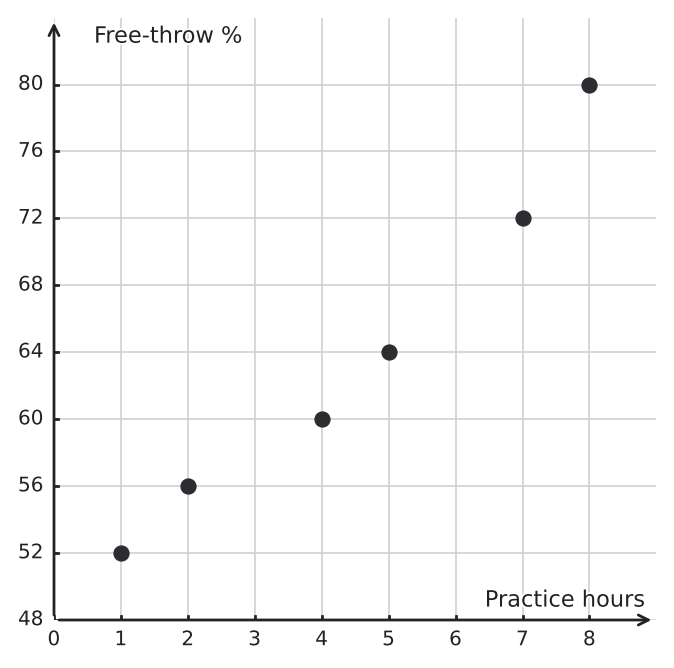
Figure for problem 554955

Hints

- Match each table row to a point using both its horizontal and vertical coordinates. - A point can have the correct \(x\)-coordinate and still be plotted incorrectly if its \(y\)-coordinate is wrong. - Describe the association only after correcting the two misplaced markers.

Solution

1. Each row must be plotted as \((\text{practice time},\text{free-throw percentage})\). 2. The candidate plot correctly shows \((1,52)\), \((2,56)\), \((7,72)\), and \((8,80)\). 3. At \(x=4\), the plot shows \((4,60)\), but the table requires \((4,64)\). That marker must move up \(4\) percentage points. 4. At \(x=5\), the plot shows \((5,64)\), but the table requires \((5,60)\). That marker must move down \(4\) percentage points. 5. After correction, the points rise overall from left to right and stay fairly close to a straight-line trend, with a modest dip at \((5,60)\). The association is strong, positive, and approximately linear.

Answer

a) \((4,60)\) should be \((4,64)\), and \((5,64)\) should be \((5,60)\). b) Move the marker at \(x=4\) up \(4\) percentage points and the marker at \(x=5\) down \(4\) percentage points. c) Strong positive, approximately linear association.

5440469
The scatter plot shows seven paired observations. a) Read the plotted coordinates from the grid and use technology to find the correlation coefficient. b) Describe the relationship among the points. c) Explain why the coefficient does not capture the strength of that relationship.
Figure for problem 544046

Hints

- Read each ordered pair directly from the grid before entering the data into technology. - Compare the entire plotted pattern with a straight line rather than only checking whether the variables are related. - Opposite linear tendencies can balance in a correlation calculation.

Solution

1. The correlation coefficient for the plotted observations is \(r=0\). 2. The points follow the exact curved rule \(y=x^2\), forming a U-shaped pattern. 3. Correlation measures linear association. The decreasing left half and increasing right half balance in the calculation, so the coefficient is \(0\) even though the variables have a perfect nonlinear relationship.

Answer

a) \(r=0\) b) The points form an exact U-shaped relationship. c) The coefficient measures only linear association, so it misses this strong nonlinear pattern.
5440489
A data set has correlation \(r=0.84\) between length \(x\), measured in centimeters, and remaining time \(y\), measured in minutes. The variables are changed to \(u=\frac{x}{100}\), length in meters, and \(v=60-y\), elapsed time. Find the correlation between \(u\) and \(v\). Explain the effect of each transformation.

Hints

- Separate each transformation into scaling and shifting parts. - Positive unit changes preserve direction. - Negating exactly one variable reflects the scatter plot and reverses the association’s sign.

Solution

1. Replacing \(x\) with \(u=\frac{x}{100}\) multiplies the first variable by a positive constant, so it does not change correlation. 2. Replacing \(y\) with \(v=60-y\) adds a constant and multiplies the second variable by \(-1\). The added constant has no effect, while the negative multiplier reverses the sign. 3. The new correlation is \(-0.84\).

Answer

The correlation between \(u\) and \(v\) is \(-0.84\).
5440499
The scatter plots show five paired observations before and after a sixth observation \((6,1)\) is added. a) Find the correlation coefficient before the new point is added. b) Use technology to find the new coefficient to the nearest thousandth. c) Explain why one point changes the coefficient so greatly.
Figure for problem 544049

Hints

- First recognize the exact pattern in the original five pairs. - Compare the new point with the continuation of that pattern. - Points far from the center of the \(x\)-values can have substantial influence.

Solution

1. The original points lie exactly on the increasing line \(y=2x\), so the original correlation is \(r=1\). 2. With \((6, 1)\) included, the correlation becomes \(r\approx 0.230\). 3. The new point has the largest \(x\)-value but a very small \(y\)-value, contradicting the original upward pattern. Its extreme horizontal position gives it strong influence on the coefficient.

Answer

a) \(r=1\) b) \(r\approx 0.230\) c) The added point is far to the right and far below the original line, so it strongly weakens the positive linear association.
5440519
Scatter plots a) and b) both have correlation coefficients that round to \(r=0.80\). Explain why the equal rounded coefficients do not make the two plots equally convincing examples of a general linear pattern.
Figure for problem 544051

Hints

- Check whether the same direction appears throughout each point cloud. - Compare the main cluster with any point far from that cluster. - Treat a correlation coefficient as a summary that must be interpreted with the plot.

Solution

1. Plot a) shows an increasing tendency spread across most of its observations. 2. Plot b) has a compact cluster with little linear direction and one distant point in the upper-right corner. 3. In plot b), the distant point largely creates the positive coefficient. The coefficient therefore does not describe a linear pattern followed by most of the data. 4. A scatter plot must be inspected for shape, clusters, and influential observations before interpreting \(r\).

Answer

Plot a) provides broader evidence of a positive linear pattern. Plot b)’s rounded \(r=0.80\) is driven largely by one influential point, so the coefficient alone does not make the patterns equally convincing.
5440579
Plot a) shows the original paired data. Plot b) shows what happens if the same \(x\)-values and \(y\)-values are sorted separately and then paired by rank. Read the coordinates from each plot and use technology to compute \(r\) for both. Explain why the rearrangement in plot b) is invalid.
Figure for problem 544057

Hints

- Read each point in plot a) as one original paired observation. - Compare how the pairings change in plot b), not just how the separate coordinate lists are ordered. - Reordering observations is harmless only when both coordinates of each pair move together.

Solution

1. For the original pairs in plot a), the correlation coefficient is \(r=-0.300\). 2. For the separately sorted lists in plot b), the coefficient is \(r=1\). 3. Sorting each variable independently destroys the original links between observations. The new perfect correlation describes invented pairs rather than the collected data.

Answer

Plot a): \(r=-0.300\). Plot b): \(r=1\). The rearrangement is invalid because paired observations must remain together.
5440589
The scatter plots show five observations on \(y=2x\) before and after the vertical outlier \((3,30)\) is added. Use technology to compare the correlation coefficients. Round the new coefficient to the nearest thousandth, and explain the change.
Figure for problem 544058

Hints

- Recognize the exact original linear rule. - Compare the new point’s vertical position with the line at the same \(x\)-value. - Correlation weakens when points move far from a linear pattern.

Solution

1. The original five points form a perfect increasing line, so \(r=1\). 2. After adding \((3, 30)\), the coefficient is \(r\approx 0.277\). 3. The outlier has an \(x\)-value at the center of the original \(x\)-values, but its \(y\)-value is far above the line. It greatly increases vertical scatter and weakens the linear association.

Answer

Before: \(r=1\). After: \(r\approx 0.277\). The large vertical outlier greatly weakens the positive linear association.
5440609
Plot a) shows all ten paired observations. Plot b) shows only the observations with \(4\le x\le7\). a) Use technology to find \(r\) for all ten pairs. b) Find \(r\) for the restricted plot. c) Explain why restricting the range of \(x\)-values can weaken a correlation.
Figure for problem 544060

Hints

- Calculate the coefficient twice using exactly the requested pairs. - Compare the horizontal spread in the two data sets. - A broad trend may be easier to detect across a wider range of explanatory values.

Solution

1. For all ten pairs, \(r\approx 0.962\), a strong positive linear association. 2. For \((4, 10), (5, 7), (6, 14), (7, 11)\), \(r\approx 0.447\), a much weaker positive association. 3. Over the narrow \(x\)-range, the overall change associated with \(x\) is smaller relative to local scatter. Removing the low and high \(x\)-values makes the broad upward pattern less visible.

Answer

a) \(r\approx 0.962\) b) \(r\approx 0.447\) c) Restricting the range of \(x\) removes much of the broad trend and leaves random variation more prominent.
5440629
The pairs \((4, 2), (4, 5), (4, 7), (4, 11)\) are entered into a calculator. The calculator does not return a correlation coefficient. Explain why \(r\) is undefined for these data rather than equal to \(0\).

Hints

- Check whether both variables actually vary. - Correlation relies on measuring each value relative to its variable’s spread. - Distinguish “no variation” from “variation with no linear pattern.”

Solution

1. Every \(x\)-value is \(4\), so the \(x\)-variable has no spread and its standard deviation is \(0\). 2. Correlation compares standardized deviations in both variables. Standardizing \(x\) would require division by its standard deviation, which is impossible when that value is \(0\). 3. Therefore, the correlation coefficient is undefined. A coefficient of \(0\) would require both variables to vary but have no linear association.

Answer

\(r\) is undefined because the \(x\)-variable is constant and has standard deviation \(0\). It is not a case of two varying variables with zero linear association.
5440649
The scatter plot shows six paired observations that rise increasingly steeply. a) Read the coordinates from the grid and use technology to find \(r\) to the nearest thousandth. b) Explain why the relatively large coefficient does not make a linear model the best description.
Figure for problem 544064

Hints

- Read the plotted coordinates before using technology. - Compare constant differences with constant factors in successive response values. - A large correlation does not remove the need to inspect shape.

Solution

1. The correlation coefficient for the plotted observations is \(r\approx 0.906\), which is a strong positive linear coefficient numerically. 2. The plotted \(y\)-values double for each increase of \(1\) in \(x\), so the points curve upward rather than following a constant rate of change. 3. Correlation measures linear association only. A high value can occur when a monotonic curved pattern resembles a line over a limited range.

Answer

a) \(r\approx 0.906\) b) The data follow exponential growth with increasing steepness, so a straight line would miss the systematic curvature.
5440669
The scatter plot shows two vibration measurements at each speed setting. Use technology to find \(r\) to the nearest thousandth. Then describe an important feature of the scatter that the single coefficient does not summarize.
Figure for problem 544066

Hints

- Calculate the coefficient using all ten paired observations. - Compare the distance between the two \(y\)-values at each repeated \(x\)-value. - Look beyond direction and strength for a change in spread.

Solution

1. The correlation coefficient is \(r\approx 0.505\), indicating a moderate positive linear association. 2. At low speed settings, the two vibration measurements are close together; at higher settings, they are much farther apart. 3. The vertical spread increases with \(x\), creating a fan-shaped pattern that is not conveyed by the correlation coefficient alone.

Answer

\(r\approx 0.505\). The association is moderately positive, but the variability in vibration increases substantially as the speed setting rises.
5440699
Two studies report the same correlation, \(r=0.78\). Study A used \(6\) paired observations, and Study B used \(80\) paired observations. What can be said about the direction and strength in both studies? Why should the sample sizes still be reported?

Hints

- Interpret the sign and magnitude before considering sample size. - Ask what information is absent from a correlation coefficient. - Consider how much influence one point could have in each study.

Solution

1. In both studies, \(r=0.78\) indicates a strong positive linear association in the observed data. 2. The coefficient itself does not show how many pairs produced it. 3. A pattern based on \(80\) observations is generally less sensitive to the placement of one or two points than a pattern based on only \(6\) observations, so sample size gives important context.

Answer

Both studies show a strong positive linear association. The sample sizes matter because the same coefficient can be much more sensitive to individual points in the smaller data set.
5440719
The scatter plot relates machine age to resale value. The open markers are three proposed additional observations. Predict how the sign and magnitude of \(r\) are likely to change if the open points are added. Explain without calculating a new coefficient.
Figure for problem 544071

Hints

- Compare the open markers with the direction of the original cloud. - Decide whether they extend the pattern or contradict it. - Stronger linear alignment corresponds to a magnitude closer to \(1\).

Solution

1. The original data show a negative linear association. 2. The open points pair larger ages with lower resale values and extend the existing downward pattern. 3. Because the added points reinforce the direction and lie close to the trend, \(r\) is likely to remain negative and move closer to \(-1\), increasing in absolute value.

Answer

The coefficient will likely remain negative and become stronger in magnitude, moving closer to \(-1\), because the added points extend and reinforce the downward linear trend.
5440729
The correlation between variables \(x\) and \(y\) is \(r=0.60\). Every \(y\)-value is then squared. Can the correlation between \(x\) and \(y^2\) be determined from the original coefficient alone? Explain.

Hints

- Compare squaring with adding or multiplying by a constant. - Think about what squaring does to negative values and unequal magnitudes. - Decide whether the original coefficient contains enough information to rebuild the transformed scatter.

Solution

1. Correlation is unchanged by adding constants or multiplying by positive constants, but squaring is not a linear transformation. 2. Squaring can change spacing, reverse the order of negative values, and alter the shape of the scatter. 3. The new correlation cannot be determined from the original value \(r=0.60\) alone.

Answer

No. Squaring \(y\) is a nonlinear transformation, so the correlation between \(x\) and \(y^2\) cannot be determined from \(r=0.60\) alone.
5440749
The original ordered pairs are \((1, 1), (2, 4), (3, 2), (4, 5)\). A reporting error causes the pair \((4, 5)\) to appear four times total instead of once. Use technology to find \(r\) for the original data and for the repeated-pair data, each to the nearest thousandth. Explain why the values differ even though no new location was added to the scatter plot.

Hints

- Enter the original four rows first, then add the repeated rows without changing their coordinates. - Distinguish the visible set of locations from how often each observation occurs. - Decide whether the repeated point supports or opposes the current direction.

Solution

1. For the original four pairs, \(r\approx 0.707\). 2. With three extra copies of \((4, 5)\), \(r\approx 0.830\). 3. Repeating only one pair gives that location extra weight in the numerical calculation. Because \((4, 5)\) supports the positive trend, the coefficient becomes more strongly positive.

Answer

Original: \(r\approx 0.707\) Repeated-pair data: \(r\approx 0.830\) The repeated location receives extra weight and reinforces the positive trend.
5440769
The scatter plot shows a simplified tide record over two cycles. Use technology to find \(r\) to the nearest thousandth. Why is a straight-line summary not appropriate for this pattern?
Figure for problem 544076

Hints

- Calculate the coefficient using the paired rows in time order. - Trace how the response changes across the time steps. - Decide whether one direction describes the entire record.

Solution

1. The correlation coefficient is \(r\approx -0.309\), indicating only a weak negative linear association. 2. The heights rise, fall, and repeat rather than changing steadily in one direction. 3. The repeating cycle is the main structure, so one straight line would hide the pattern.

Answer

\(r\approx -0.309\). A linear summary is not appropriate because the data follow a repeating rise-and-fall cycle.
5440779
The scatter plot shows a device that stays off for settings \(1\) through \(4\) and turns fully on for settings \(5\) through \(8\). Use technology to find \(r\) to the nearest thousandth. Explain why the coefficient alone gives an incomplete description.
Figure for problem 544077

Hints

- Calculate the coefficient, then list how the response changes from one setting to the next. - Look for a sudden transition rather than a constant rate. - Use both numerical strength and scatter-plot shape in the description.

Solution

1. The correlation coefficient is \(r\approx 0.873\), which is strongly positive numerically. 2. The response does not increase gradually; it jumps from \(0\) to \(10\) between settings \(4\) and \(5\). 3. The scatter has a threshold or step pattern, not a straight-line pattern.

Answer

\(r\approx 0.873\). The association is strongly positive, but the actual pattern is a step change rather than a steady linear increase.
5440809
Measurements were recorded as \((1.1, 1.4), (2.2, 2.1), (3.3, 2.9), (4.4, 4.2), (5.5, 5.0)\). A second analyst rounds each coordinate to the nearest whole number before calculating correlation. Find \(r\) for the original data and for the rounded data, each to the nearest thousandth. What does the comparison show?

Hints

- Calculate the coefficient before changing any coordinates. - Write the rounded ordered pairs explicitly before the second calculation. - Compare both the numerical values and the qualitative strength.

Solution

1. The original data have \(r\approx 0.994\). 2. The rounded pairs are \((1, 1), (2, 2), (3, 3), (4, 4), (6, 5)\), with \(r\approx 0.986\). 3. Rounding changed the relative positions of the points slightly, so the coefficient changed, although both data sets still show a very strong positive association.

Answer

Original data: \(r\approx 0.994\) Rounded data: \(r\approx 0.986\) Rounding can change correlation because it changes the paired values, even when the overall conclusion remains similar.
5440819
A researcher codes three bus colors as blue \(=1\), green \(=2\), and red \(=3\), then calculates a correlation between the color code and route delay. Explain why the coefficient would not have a meaningful interpretation, even if a calculator returns a number.

Hints

- Ask whether differences such as \(3-2\) have a real meaning for the variable. - Consider what would happen if the colors were assigned different numbers. - Distinguish category labels from numerical measurements.

Solution

1. The numbers \(1,2,3\) are arbitrary labels for categories, not quantitative measurements with meaningful spacing. 2. A different coding order would change the calculated coefficient without changing the buses or delays. 3. Pearson correlation is therefore inappropriate for these nominal color categories.

Answer

The coefficient is not meaningful because the color codes are arbitrary category labels. Changing the codes could change \(r\) even though the underlying data stay the same.
54408512
Plot a) pairs each day's rainfall with the same day's river level. Plot b) pairs each day's rainfall with the next day's river level. Use technology to calculate both correlations to the nearest thousandth and explain the difference.
Figure for problem 544085

Hints

- Read the ordered pairs from each plotted panel. - In plot b), each rainfall measurement is paired with the following day's river level. - Compare which pairing reflects the timing described by the context.

Solution

1. Pairing rainfall and river level from the same day gives \(r\approx -0.231\). 2. Pairing Day \(1\) through Day \(6\) rainfall with Day \(2\) through Day \(7\) river level gives \(r\approx 0.991\). 3. The one-day-lag pairing aligns each rainfall measurement with the following day's river level, revealing a strong positive lagged association that the same-day pairing misses.

Answer

Same-day pairing: \(r\approx -0.231\) One-day-lag pairing: \(r\approx 0.991\) The delayed pairing captures a strong positive lagged association between rainfall and the following day's river level.
54408612
The scatter plot shows two production lines analyzed separately. a) State the correlation within each line. b) Use technology to find the correlation after combining all six pairs. c) Explain the reversal in direction.
Figure for problem 544086

Hints

- Analyze each group before pooling the data. - Compare the locations of the two entire clusters. - Separate the within-group direction from the between-group shift.

Solution

1. Within each line, the points lie exactly on a decreasing line, so each correlation is \(r=-1\). 2. For all six pairs together, \(r\approx 0.686\). 3. Line B has both larger \(x\)-values and larger \(y\)-values than Line A. The separation between the two groups creates a positive combined trend that overrides the negative within-line trends.

Answer

a) Line A: \(r=-1\); Line B: \(r=-1\) b) Combined: \(r\approx 0.686\) c) The group-level separation creates a positive overall pattern even though each group individually decreases.
5440889
A scatter plot has \(r=0.71\). a) The x-axis is displayed in reverse order, but the stored data are unchanged. What happens to \(r\)? b) Instead, every stored \(x\)-value is multiplied by \(-1\). What happens to \(r\)?

Hints

- Decide whether each action changes the actual ordered pairs or only their display. - Recall what a negative rescaling does to direction. - Keep visual orientation separate from stored numerical values.

Solution

1. Reversing only the displayed axis changes the picture’s orientation but not the data, so \(r\) remains \(0.71\). 2. Multiplying every \(x\)-value by \(-1\) is a negative linear transformation of one variable. 3. That transformation reverses the direction of association, so the new coefficient is \(-0.71\).

Answer

a) \(r=0.71\) b) \(r=-0.71\)
5440899
Both scatter plots lie entirely in Quadrant I. Find the correlation for each data set. What does this show about using quadrant counts to predict correlation?
Figure for problem 544089

Hints

- Inspect the left-to-right direction in each set. - Remember that correlation uses deviations from the means. - Compare the two patterns even though all coordinates are positive.

Solution

1. Data set A lies exactly on an increasing line, so \(r=1\). 2. Data set B lies exactly on a decreasing line, so \(r=-1\). 3. Both sets have the same quadrant count, yet their correlations have opposite signs. Correlation depends on positions relative to the variable means, not simply on coordinate quadrants.

Answer

Data set A: \(r=1\) Data set B: \(r=-1\) Quadrant counts alone do not determine the direction or strength of correlation.
5440909
The scatter plot contains exactly two observations, and both variables change between them. Determine the correlation coefficient without using technology. Then explain why any two observations with both variables changing must have \(|r|=1\), why the sign is negative for this plot, and why this perfect correlation by itself is not strong evidence of a general relationship.
Figure for problem 544090

Hints

- Read the direction of the line through the two plotted points. - Ask whether either point can fail to lie on the unique line determined by those two points. - Separate the numerical value of the correlation from the amount of evidence supplied by only two observations.

Solution

1. The two plotted points determine one unique nonvertical line, and the line decreases from left to right. 2. With only two observations, both points lie exactly on that line, so the linear association for these two points is perfect. 3. Therefore \(|r|=1\). Because the line decreases, the sign is negative, giving \(r=-1\). 4. If the line through two varying observations increased instead, the correlation would be \(r=1\). 5. With only two observations, perfect alignment is automatic whenever both variables vary, so \(|r|=1\) provides essentially no evidence that a larger population follows the same relationship.

Answer

\(r=-1\). With exactly two observations and nonzero variation in both variables, the points form a perfect linear pattern, so \(|r|=1\). The plotted line decreases, so the sign is negative. Because perfect correlation is automatic with only two varying observations, this result alone is not convincing evidence of a general relationship.
5440919
The scatter plot shows six paired observations with a generally downward pattern and one local increase. Read the coordinates from the plot and use technology to find \(r\) to the nearest thousandth. Explain why the local increase does not make the overall correlation positive.
Figure for problem 544091

Hints

- Read and use all six plotted pairs rather than comparing only one adjacent change. - Look at the broad left-to-right direction. - Separate one local change from the overall association.

Solution

1. The correlation coefficient for the six plotted observations is \(r\approx -0.952\). 2. One adjacent pair shows a local increase, but most larger \(x\)-values are paired with substantially smaller \(y\)-values. 3. Correlation summarizes the overall linear pattern, which remains strongly negative.

Answer

\(r\approx -0.952\). The single local increase does not outweigh the strong overall downward trend.
5440929
A graphing app has a “hide selected points” option. A scatter plot currently has correlation \(r=0.41\). a) Three points are hidden from view, but they remain in the data table and in calculations. What happens to \(r\)? b) The same three rows are then deleted from the data table. Must \(r\) still equal \(0.41\)? Explain.

Hints

- Distinguish a display setting from a data edit. - Ask which ordered pairs the calculator includes in each case. - Consider whether the locations of the deleted points are known.

Solution

1. Hiding points only changes what is displayed, so the calculated correlation remains \(r=0.41\). 2. Deleting rows changes the set of ordered pairs used in the calculation. 3. The new coefficient after deletion could increase, decrease, or change sign depending on the deleted points.

Answer

a) \(r=0.41\) b) No. Deleting the rows changes the data, so the new correlation cannot be determined without knowing those points.
5440949
The scatter plot shows recorded output from a sensor that should follow \(y=2x\) but cannot display values above \(10\). Use technology to find the correlation for the recorded data to the nearest thousandth. Explain the effect of the sensor limit.
Figure for problem 544094

Hints

- Use the recorded values, not the values the sensor should have shown. - Compare the upper observations with the original rule. - Look for how repeated maximum readings alter the shape.

Solution

1. The recorded pairs have correlation \(r\approx 0.922\). 2. The sensor ceiling replaces the expected values \(12,14,16\) with repeated values of \(10\). 3. The upper points flatten instead of continuing on the line, so the association remains strongly positive but is no longer perfect.

Answer

\(r\approx 0.922\). The display ceiling creates a flattened cluster at \(y=10\), weakening the original perfect linear relationship.
5440509
The scatter plots show five observations before and after the distant point \((20,20)\) is added. Use technology to find the correlation coefficient for each plot. Round to the nearest thousandth, and explain what the comparison shows.
Figure for problem 544050

Hints

- Calculate the coefficient for the compact cluster before including the distant pair. - Compare the location of the added point with the center of the original cloud. - A strong coefficient may be sensitive to a point with an extreme \(x\)-value.

Solution

1. For the first five points, the coefficient is \(r\approx -0.189\), indicating little linear association. 2. After adding \((20, 20)\), the coefficient is \(r\approx 0.968\), indicating a very strong positive linear association numerically. 3. The distant point is far from the other \(x\)-values and \(y\)-values. It largely determines the upward direction of the combined point cloud, so the large coefficient is driven by one high-leverage observation.

Answer

Before: \(r\approx -0.189\). After: \(r\approx 0.968\). One distant point changes a weak pattern into an apparently strong positive linear association.
5440659
The scatter plot shows two calibration methods tested at the same four input settings. Within each method, \(r=1\). Combine all eight ordered pairs and use technology to find the overall correlation coefficient to the nearest thousandth. Explain why it is much weaker.
Figure for problem 544065

Hints

- Keep the ordered pairs intact when entering all eight observations. - Compare the pattern within each method with the pattern created after pooling them. - Consider what the vertical gap between methods contributes to the combined scatter.

Solution

1. For the eight combined pairs, the correlation coefficient is \(r\approx 0.218\). 2. Each method has an exact positive linear pattern, but Method B is shifted upward by \(10\) units at every input setting. 3. At each \(x\)-value, the large vertical difference between methods is unrelated to \(x\), so combining the groups adds vertical variation that weakens the overall linear association.

Answer

The combined correlation is \(r\approx 0.218\). The two parallel groups each have perfect positive correlation, but their large vertical separation obscures the within-method trend when the groups are pooled.

All problems may be used, copied and printed free of charge for school and tutoring, including paid tutoring. Commercial adaptations as well as publication or redistribution on the internet are not permitted.